The masthead: it’s the very first thing one sees when reading a paper. It contains its title, aims to encapsulate its identity, and draws readers to its pages.
From refined fonts to hand-drawn sketches, Vermont’s historical newspaper masthead designs are a visible representation of the story of our state’s media past and the art of selling the news.
Below are just a few of the mastheads of Vermont newspapers we’ve digitized thus far in the project. Some of these mastheads lasted for decades, others, mere weeks.
Politics and Selling a Point of View:
Le Patriote Canadien, a French-language paper, was published by Ludger Duvernay, a French-Canadian printer and journalist, between 1839-1840. Following the Rebellion in Lower Canada (La rébellion du Bas-Canada) in 1837-1838, Duvernay escaped to Vermont, where he began publishing his views on rebellion and more in Burlington, Vermont. The masthead conveys strongly Duvernay’s message, with an eagle bearing the Patriote‘s motto:
![Banner detail: "L'Union fait la Force" [Strength in Unity]](https://library.uvm.edu/vtnp/wp-content/uploads/2014/01/banner-detail-union-fait-la-force.jpg)
Read more on Le Patriote Canadien.
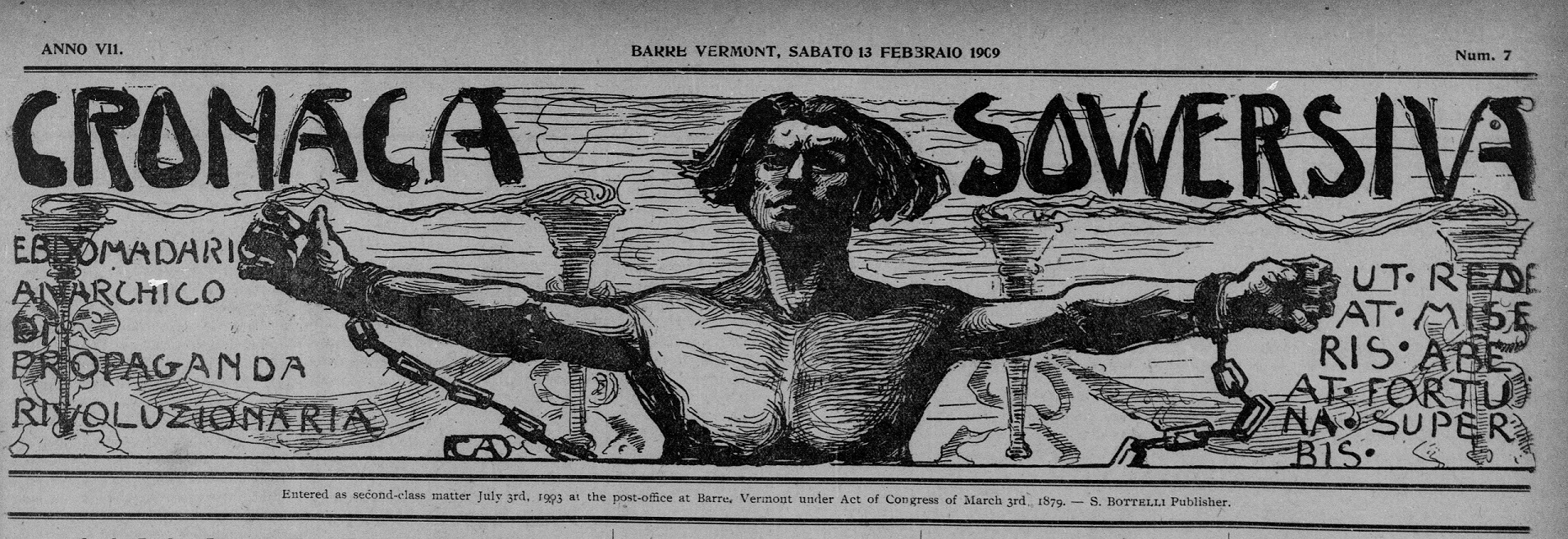
Luigi Galleani (1861-1931) , one of the most important 20th century Italian-American anarchists in the country, published the Cronaca Sovversiva, a independent and highly influential Italian-language radical paper from 1903-1920. Carlo Abate (1860-1941), an Italian-American artist, proponent of social justice, and resident out of Barre, Vermont, designed the unique mastheads and additional artwork for the Cronaca Sovversiva. The above masthead features a man with arms outstretched, perhaps breaking loose of the chains that had been restricting him. View more Cronaca mastheads.
Simple in its appearance, the Daily Green Mountain Freeman chose to focus on a bold, mission-encapsulating statement: Freedom: its Interests, its Rights, and its Honor, for its masthead. Published during the Civil War, it documented the happenings from a Vermont and anti-slavery perspective. Its editor, C.W. Willard also published the weekly Green Mountain Freeman simultaneously, which had a similar masthead.
The Spirit of the Age, started in Woodstock, Vermont, as a partisan paper for the Democrats in 1845. Standing up for the “People’s Rights–a Representative Democracy–the Constitution and the 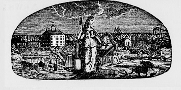 Union without any infractions,” the paper’s masthead also featured briefly for a period of a month in 1862 a detailed image of Lady Liberty standing amid a hectic, industrious, and prosperous landscape.
Local and State Identity:
The Bennington Semi-weekly Banner in 1897 briefly featured the Bennington Battle Monument, which was completed in 1891.
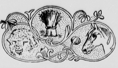
The Middlebury Register featured at one point in its history aspects integral to agricultural community it catered to: Merino sheep, wheat, and horses.
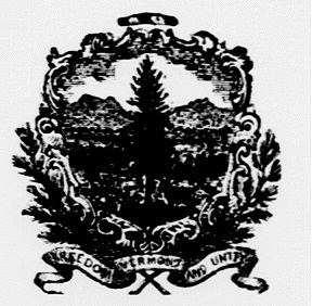
The St. Johnsbury Caledonian featured the Vermont state seal in its masthead.
Eye-catching Aesthetics:
The News, Plain and Simple:
Refined, Elegant, and Established Fonts:
Images of the Printing Press:
*************
It’s important to note that these mastheads are organized from one person’s point of view. With that said, what are some of your favorite newspaper mastheads? What do the title, font, or images say to you? What do you think they were trying to convey with the design? Is it effective today?
It’s interesting, too, to see how many of these newspapers’ mastheads changed over time–for instance, the Spirit of the Age underwent numerous masthead revamps over the years–from a simple font to a larger and more ornate masthead (see above image), and then back again to the basics. These could reflect a variety of things, including changes in editors, new directions, or marketing strategies.
More ways to find, use, and share Vermont’s historic newspaper mastheads:
- View the Flickr album.
- View the Pinterest album.
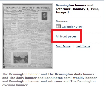
- To view a newspaper’s front pages over time on Chronicling America, go to the paper’s homepage (e.g., the Bennington Banner and Reformer‘s “About” page: https://chroniclingamerica.loc.gov/lccn/sn98060016/) and then click on the “All Front Pages” link.
-K. Norwood


