
News

The UVM Libraries now subscribe to BioRender with a 300-seat license assigned to specific individuals. In order to keep the price of this database affordable, we needed to renegotiate and forgo our site-level subscription. Have no fear, no content has been deleted, and all our current users will still be able to access their existing accounts and content.

Enter the Howe media lab and you might find students wearing virtual reality (VR) headsets, a faculty member printing 3D models of pollen specimens, or an entire class engaged in world travel through VR. The creative possibilities are endless in the Center for Multimedia Development (CMD) lab, located on the first floor of Howe Library, a makerspace for mixed media projects. The possibilities are endless. Read more about the lab's capabilities.

Come tour the library and put your name in for one of our fabulous raffle prizes!! To kick off Research Week (April 15 - 19), UVM Libraries will host a special research open house to showcase libraries’ services and resources that support research at UVM - Monday, April 15, 1 - 3 p.m.
 Anti-fat bias is everywhere. Curious about how our society perpetuates weight stigma and centers diet culture? Do you have thoughts on weight-centric health care? Join the Center for Health and Wellbeing and UVM Libraries in discussing these questions and Aubrey Gordon’s book What We Don’t Talk About When We Talk About Fat - Wednesday, March 27, 11:30 a.m. - 1 p.m. in the Dana Health Sciences Library Classroom.
 A recent workshop in Dana Health Science Library's classroom highlighted the many ways librarians support patrons who work and study in the health sciences. Library users need not wait for an orientation — familiarize yourself with access to resources and services.
Spotlight

UVM Libraries' Silver Special Collections is honored to accept the donation of retired U.S. Senator and current UVM President's Distinguished Fellow Patrick Leahy's personal Senate papers. As the article mentions, over the next several years, a team of congressional papers archivists and student interns will work to catalog and organize the extensive collection.

Learn more about this fascinating intersectional graphic memoir and browse other graphic novels in our libraries' collections. Stop by and check it out!
![]()
The UVM Libraries has a new subscription to Altmetric Explorer. UVM and UVMMC researchers can now track the attention their research output (scholarly articles and data sets) receives in the press, from academia, and on social media.

Join the UVM community in bringing awareness to current efforts directed toward dismantling diet culture and promoting body liberation. This collection offers texts from individuals advocating for fat acceptance via lived experiences, intersectional identities and/or interest in equity for all body sizes.

Dana Health Sciences Library has been given one (1) free 2023 Library Pass for Vermont State Historic Sites by the Vermont Division for Historic Preservation in collaboration with the Vermont Department of Libraries. Come check it out from the library!
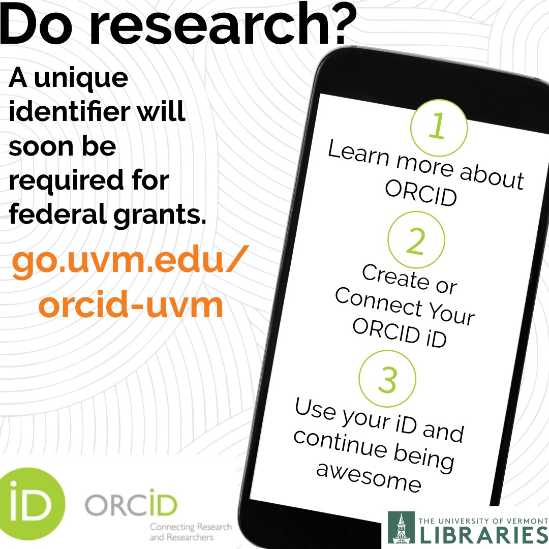
Give your research the visibility and safekeeping it merits by creating an ORCID® iD! #UVM has recently become a member organization of ORCID and has built a university integration to connect our institution with your ORCID record/profile. As a researcher, your ORCID iD is a sixteen-digit unique and persistent digital identifier that distinguishes you from every other researchers and ensures that your work is easily discoverable and accessible. By 2025, U.S. federal funding agencies will require researchers to have a unique identifier when applying for federal grants. This will help you get credit for your research outputs and streamline your reporting obligations for grants and awards. To register for an iD and connect it to UVM, visit go.uvm.edu/orcid-uvm.